Responsive Design and adaptative layout patterns
RWD is an approach to web design aimed at allowing desktop webpages to be viewed in response to the size of the screen or web browser one is viewing with. Thus, using responsive design techniques, webpages layout are enabled to adapt to a variety of screen sizes.
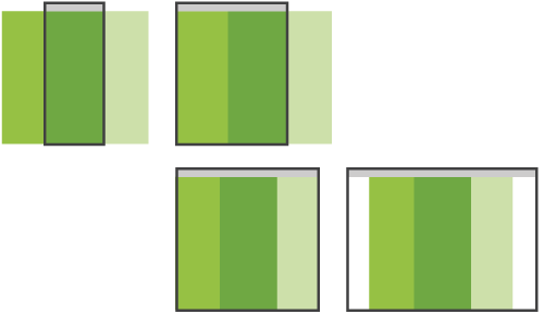
A key part of this design approach is the use of fluid, proportion-based grids. The fluid grid concept calls for page element sizing to be in relative units like percentages, rather than absolute units like pixels or points. For that purpose, space is divided in a row-column fashion schema where several elements can share the same row by spanning one or multiple columns.
Implementation of responsive design has led to a common set of layouts frequently used by designers. From a high-level perspective, we could classify them into 5 categories: mostly fluid, column drop, layout shifter, tiny tweaks and off canvas
